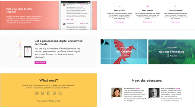
Visual connections in modular design systems
Interaction Designer, Alla Kholmatova, discusses how we consider typography sizing, spacing and function as part of our approach to modular design.
FutureLearn’s Interaction Designer, Alla Kholmatova, discusses how we consider typography sizing, spacing and function as part of our modular approach to design.
When designing in a modular way it’s easy to get carried away with defining individual components. These parts are often the easiest to notice because many of them are visible, tangible things – for instance we have no trouble defining images, text fields, buttons or interactive controls within a design system.
But what links all of the elements together and creates visual coherence? For example, how does colour relate to typography? How does typography relate to spacing? What are the different patterns and combinations that would work for certain types of content and reflect their function?
It’s the relationships between the visual properties that make a design feel whole, rather than a patchwork of elements.
Consistent, not uniform
Achieving visual unity and coherence in a design that’s made up of individual components, and designed by different people, can be tricky. One difficulty we’ve always had when working with modular design at FutureLearn is making modules consistent but not uniform.
For example, we wanted to use heading sizes and spacing consistently across the modules but we didn’t want to have just one heading size, or use the same spacing in all the modules. Each module has a different function, and making them look the same is not what we wanted.
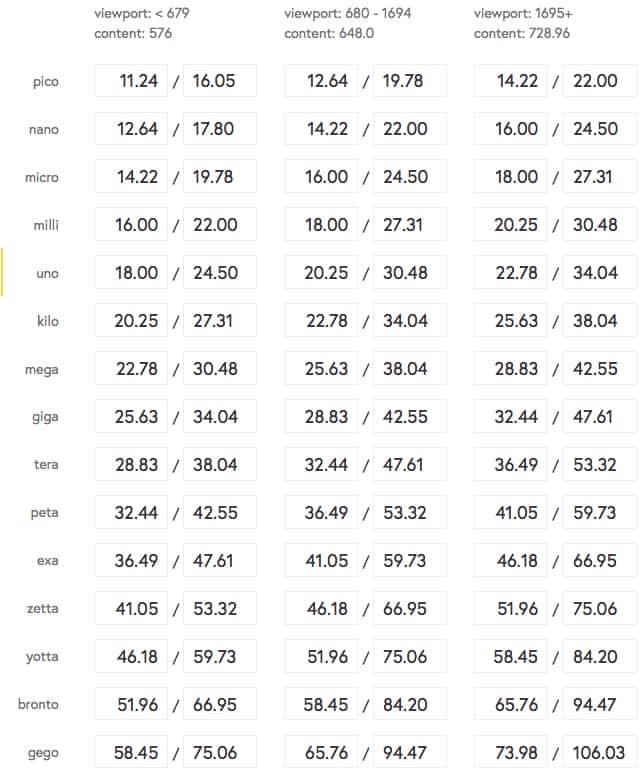
At the same time we’ve struggled with keeping the headings consistent. We have a typographic scale, which is what all typography on FutureLearn is based on. But every time we created a new module it wasn’t clear which sizes to pick from this scale.
When you design for an article, or a full page, the hierarchy of headings is clear. But when you work with modules you can’t easily predict where the component you’ve designed will appear on the page, who will use it or in what context. Getting the typographic hierarchy right becomes more difficult.
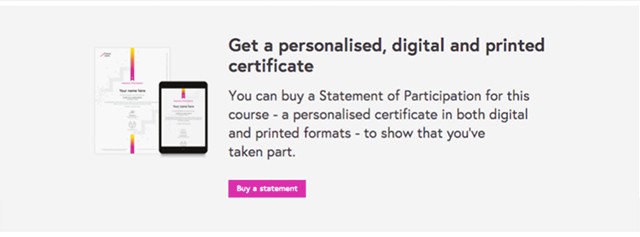
For example, we have a module called “billboard”. Its function is to focus the user’s attention on the most important action. What determines the heading size and the spacing in a billboard – i.e. why is the heading this particular size and why is the spacing between the elements the way it is?

On the other hand, why, when we have a module like this one, is the heading smaller?
It may be obvious (to the designers who came up with this module) that using a large heading doesn’t make sense in this case. But how much smaller should it be? And how does it affect the proportions of other elements within this module? How does it affect spacing, for example?
Spacing and typography are connected
Typography and spacing are closely related – large higher contrast typography requires more white space, otherwise the design starts looking cluttered. On the other hand, smaller text can get lost in the same amount of white space if you don’t compensate by reducing the padding. These are basic visual design principles, but should we make them part of the system, so that we don’t have to newly define them every time?
The solution we arrived at is to divide the modules into several main types, based on their function, typographic contrast and spacing:
Spacious
Typographic contrast: high (Font sizes Yotta + Uno in the scale)
Spacing: “spacious”
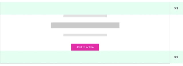
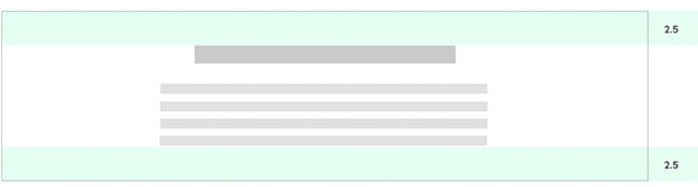
The first module type is called “spacious”. Spacious modules have high typographic contrast (by typographic contrast we mean the proportion of heading to body font size, or a large heading). Spacious modules also have generous spacing (by that we mean the padding on the container, and not the space between the text elements (label, title, intro, button) to balance out the high contrast typography – 3.5 relative units (we use relative units that are proportional to the base line height in the typographic scale).
Normal
Typographic contrast: regular (Font sizes Exa + Uno in the scale)
Spacing: “normal”
Then we have “regular” modules, which form the majority of sections on FutureLearn. They have the default heading and spacing.
Compact
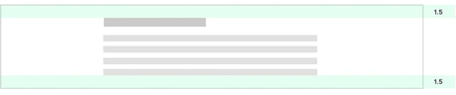
Typographic contrast: low (Font sizes Mega + Uno in the scale)
Spacing: “cosy”
And then there are “compact” sections where the heading is only slightly larger than the body copy. These three types are also described in our pattern library, alongside section and content atoms.
The type of modules reflects their function
Those three types also reflect the function of the modules.
For example, we want to use the spacious type for the high impact sections that would benefit from high contrast typography. On the other hand, when we design a module with a supporting function (something that may be part of the footer, or a supporting promotional element) then we tend to use the compact type.
Spacious
Regular
Compact
Linking the function of a module with typographic contrast and spacing helps to create those visual connections.
One interesting example of how those connections can be described is this visual loudness scale by Tom Osborne. Visual loudness is a great metaphor that helps to link the function of an element to its presentation. The idea is that, the more prominent an element is, the more “loud” it is in this imaginary scale. This helps to make sure the elements don’t compete for attention when using them in the modules and that there’s more harmony in the way the way they work together.
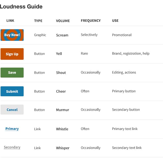
In a similar way, you can also see the “spacious” modules as being more “loud”, and the compact ones as more “quiet”. Even the name of the module can sometimes suggest its place in the imaginary scale – for example, we have a supporting module called “whisper box”. It’s quiet, as the name suggest.
Another way to think about it is to imagine that your interface is not visual, that it’s being read out by a voice. When would that voice need to get louder and change intonation? Then think about how that volume and intonation can be expressed visually, through the relationships between the elements within the modules, as well as their hierarchy in the overall design. (Thinking of it this way, of course, also has an additional advantage of making it more accessible to screen readers).
There is no system without connections
The relationship between function, heading size and spacing described above is only one example of defining such connections, but a number of them must exist to a system to make it coherent.
Making these visual connections part of the system can help to give your designs the unity that can be so difficult to achieve when designing with modules. Because without connections, a system is merely a sum of its parts.
Want to know more about modular design at FutureLearn? Read all of Alla’s posts. Or find out how we work in more Making FutureLearn posts.


